Bullish
Bearish


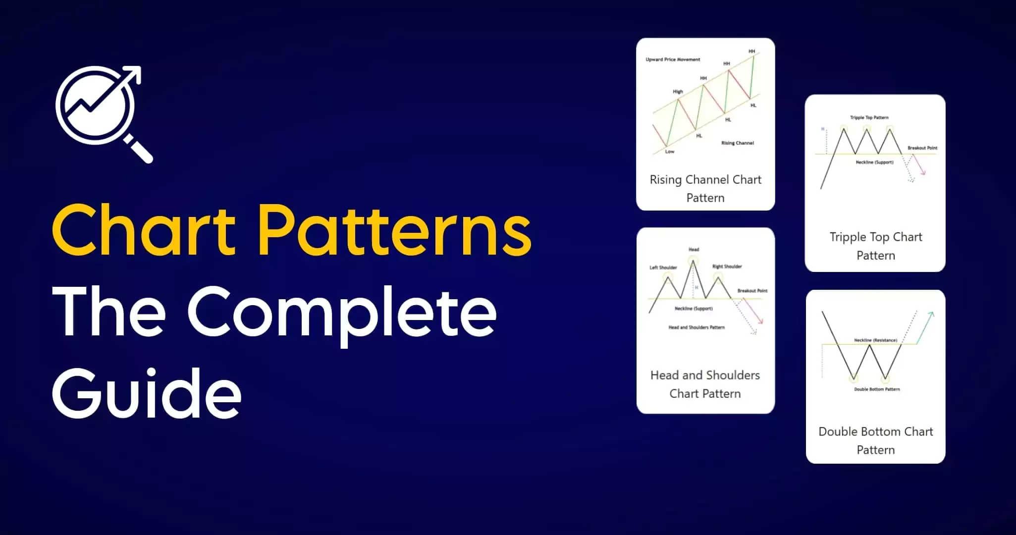
20+ Powerful chart patterns every trader should know for future trends, reversals breakouts in markets. double top, head & shoulder, pole and flag, cup and handle, rising wedge, falling wedge, ascending descending triangles, and more…
Unlock the secrets of trading with Chart Patterns The Complete Guide! Whether you’re a beginner or a pro, master the art of smart trading effortlessly.
Chart patterns provide valuable insights into market sentiment and price movement so learn how chart pattern works and decode the market together!
In this blog article, we will discuss all 20+ powerful profitable chart patterns, but before that, let us discuss how to read chart patterns.
Let’s start! Trade Smart!
Chart Patterns
If you’re looking for detailed information about chart patterns, you’ve come to the right place yah! It doesn’t matter if you’re a beginner or a pro trader but if you’re serious about becoming a professional trader in the future, you’ll need this article. Most people don’t know how to trade price action correctly and they confuse the patterns, or they pick the wrong ones to trade. That’s why I created this ultimate guide on chart patterns to learn seamlessly.

Rising Channel Chart Pattern
A rising channel pattern is a part of technical analysis formed on a chart by two parallel upward trendlines, the upper trendline connecting the higher highs and the second bottom trendline connecting the higher lows of a price movement. This pattern indicates a bullish trend, likely to continue rising within the channel until it breaks.
Refer below example: The area between the two trendlines is the known as rising channel, price makes a series of higher highs and higher lows within the channel. (HH: higher high, HL: higher low)
In the rising pattern, the lower trendline acts as support, while the upper trendline acts as resistance. The price is expected to bounce off these lines within the channel.

A rising channel is considered a continuation chart pattern because it suggests that the prevailing uptrend is likely to persist. Traders used that the price will continue to move within the channel until a breakout occurs.
Breakout of the rising channel pattern can occur in two ways. The price may break above the upper trendline, signaling a potential acceleration of the uptrend. Alternatively, the price may also break below the lower trendline, suggesting a potential change in trend direction.
Rising channel trade guide
Buying Signal: Look for buying opportunities near the lower trendline. Look at the above image, it contains HL points. (HL: higher lows)
Selling Signal: Consider selling near the upper trendline, especially if the price is an overbought zone. Look at the above image, it contains HH points (HH: higher high)
Stop Loss: Place stop-loss orders below the lower trendline for buying and place a stop loss above the higher trendline for selling to limit potential losses.
Falling Channel Chart Pattern
A falling channel is a part of technical analysis formed on a chart by two downward parallel trendlines, the upper trendline connecting the lower high and the second bottom trendline connecting the lower lows. This pattern indicates a bearish trend, likely to continue falling prices within the channel until it breaks and shows sellers dominating the market. Falling channel, also known as a descending channel or bearish channel,
Refer below example: The area between the two downward trendlines is the known as falling channel, price makes a series of lower lows and lower highs within the channel. (LL: lower low, LH: lower high)
In the falling pattern, the lower trendline acts as lower low support, while the upper trendline acts as a lower high resistance. The price is expected to bounce off these lines within the channel.

A falling channel is considered a continuation chart pattern because it suggests that the prevailing downtrend is likely to persist. Traders used that the price will continue to move within the channel until a breakout breaks the channel.
Breakout of the falling channel pattern can occur in two ways. The price may break above the upper trendline, signaling a potential acceleration of the uptrend. Alternatively, the price may also break below the lower trendline, suggesting a potential continuation in the trend direction.
Falling channel trade guide
Selling Signal: Consider selling near the upper trendline, especially if the price is an overbought zone. Look at the above image, it contains LH points (LH: lower high)
Buying Signal: Look for buying opportunities near the lower trendline. Look at the above image, it contains LL points. (LL: lower low)
Stop Loss: Place stop-loss orders above the upper trendline for selling and place a stop loss below the lower trendline for buying to limit potential losses.
False breakout: If the price breaks below/above the trendline but then quickly falls/rises back into the channel shows a false breakout. So don’t enter earlier, wait for a retest to get a perfect entry with minimal stop loss.
Double Bottom Chart Pattern
The double-bottom chart pattern is a bullish reversal pattern that typically forms after a downtrend. It looks like the letter “W” on the price chart.
The double bottom is a bullish reversal pattern, It indicates that the sellers are losing momentum, and the buyers are gaining control. The first bottom represents the initial buying pressure and, the sudden bounce shows a retrestment or profit booking, but the second bottom shows another test of the previous low and also potential potential recovery.

The first low marks the lowest point in the downtrend, Sellers are in control, but some buyers start to emerge. After the first low, there’s a profit booking and upward rally in the price, but during the second time the price declines again, but it doesn’t go as low as the first low. This forms the second bottom, and it’s a key point of the pattern. When the price breaks out from the resistance level or the neckline shows the clear W double bottom pattern.
It’s like the market tries to say, “Hey, I tried going lower twice, didn’t like it, and now I’m ready to climb higher!”
Double Bottom Trade Guide
Traders should spot if two rounding bottoms are forming with equal lows just like W, and also note the size of the bottoms.
Confirmation: A double bottom is not confirmed until the price breaks above the neckline, which is the horizontal line connecting the two peaks of the W.
Stop Loss: Traders typically set a stop-loss order just below the lowest point of the pattern to manage risk.
The price target should be equal to the height or distance between the neckline and the bottoms.
Double Top Chart Pattern
The double-top chart pattern is a bearish reversal pattern that typically forms on top of an uptrend. It looks like the letter “M” on the price chart.
The double top is a bullish reversal pattern, It indicates that the buyers losing momentum, and the sellers are gaining control. The first top represents the initial selling pressure and, the sudden fall shows a retrestment or profit booking, but the second top shows another test of the previous low and also potential recovery.

The double top suggests that buyers are losing momentum and that sellers are gaining control.
Double Top Trade Guide
Traders should spot if two rounding tops are forming with equal highs just like M, and also note the size of the top.
Confirmation: The price breaks below the neckline support, which is the horizontal line connecting the lows between the peaks. This confirms the double-top pattern and suggests a potential trend reversal.
Stop Loss: Traders typically set a stop-loss order just below the high point of the pattern like the second top to manage risk.
Triple Bottom Chart Pattern
A triple bottom is a chart pattern that occurs at the end of a downtrend. It is a bullish candlestick chart pattern that consists of three consecutive failed attempts at new lows near the same price and is confirmed once the price breaks higher above the neckline or resistance.

The first bottom of this pattern found support at a particular level indicating a retrestment or profit booking. but when the price tries to break the previous low buyers are much stronger and reverse the market but also fail. In this battle buyers successfully create the three lows confirming the pattern and neckline breakout suggesting a shift in market sentiment from bearish to bullish.
All these attempts resulted in sellers losing their faith, buyers overtaking sellers and causing the price to rise and the trend to reverse.
Triple Bottom Trade Guide
Traders should spot three same lows within a downtrend, refer above image to clear doubts.
Confirmation: A breakout occurs when the price closes above the neckline. This confirms the possibility of a bullish reversal and indicates that the price is likely to continue rising. (Most of the traders use volume indicator for confirmation)
Some traders prefer to wait for a pullback/retreatment, before opening a new trade to protect the capital from false breakout.
Stop Loss: Traders typically set a stop-loss order just below the low point of the pattern just like the low third bottom to manage risk OR Place the stop loss below the neckline after the retest to avoid much more risk.
Triple Top Chart Pattern
The triple top is a bearish chart pattern that tests the high of a price three consecutive times before the price falls and breaks to new lows. As completely opposed to the triple bottom, it appears at the end of an uptrend suggesting a bullish to bearish trend change possibility.

The first top of this pattern found resistance at a particular level indicating a profit booking. but when buyers try to break the previous top/high on second and third attempts the sellers are much stronger and reverse the market at the same level In this battle sellers successfully create the triple top and neckline breakout suggesting a shift in market sentiment from bullish to bearish.
Triple Top Trade Guide
Traders should spot three same highs at the top of an uptrend, refer above image to clear doubts.
Confirmation: A breakdown occurs when the price closes below the neckline. This confirms the possibility of a bearish reversal and indicates that the price is likely to continue falling. (Most of the traders use volume indicator for confirmation)
Some traders prefer to wait for a pullback/retreatment, before opening a new trade to protect the capital from false breakout.
Stop Loss: Traders typically set a stop loss above the high point of third top to manage risk OR Place the stop loss above the neckline after the retest to avoid much more risk.
Head and Shoulders Chart Pattern
The Head and Shoulders pattern is a popular and well-known pattern, as the name suggests the shape of a human head along with two shoulders. This is a reversal pattern and acts as a bearish reversal from the top of the charts indicating that an uptrend now nearing its end and a downtrend is likely to start.

Refer above example, The pattern consists of three peaks including a higher peak known as the head between two lower peaks known as the shoulders.
Shoulders: The first peak on the left side and the third peak on the right side of the pattern, usually both are equal in height.
Head: The highest peak is formed in the middle after the left shoulder, Higher than the high left shoulder.
Neckline (support): A horizontal line or a slight trendline is drawn across the lowest points of the bottom between the shoulder and head, this represents a support level or neckline.
This pattern suggests buyers are losing momentum. The head is the highest peak, representing a final attempt by buyers to push the price higher, but they fail and sellers create a right shoulder lower than or equal to the left shoulder that confirms the weakness and causes a reversal possibility.
Head and Shoulders Trade Guide
Confirmation: When the price breaks below this neckline/support. This breakout is considered as the trend is reversed downward.
Stop loss: Traders place stop loss above the right shoulder to limit potential losses if the pattern fails.
Target: The target is a vertical distance from the head to the neckline.
Inverse Head and Shoulders Pattern
Similarly, The Inverted pattern is exactly the opposite pattern of the original pattern of head and shoulders but is formed after a prior downtrend and is usually a bullish reversal pattern.

Refer to the above example, The pattern consists of three lows including the lowest point known as the inverse head between two lower peaks known as the inverse shoulders.
Shoulders: The first low on the left side and the third low on the right side of the pattern, usually both are equal in height.
Head: The lowest point is in the middle after the left shoulder, usually lower than the lows of the left shoulder.
Neckline (Resistance): A horizontal line or a slight trendline is drawn across the highest points of the tops between the shoulder and head, this represents a resistance level or neckline.
This pattern suggests sellers are losing momentum. The head is the lowest point, representing a final attempt by sellers to push the price lower, but they fail and buyers create a right shoulder higher than or equal to the low of the left shoulder confirming the weakness and causing a reversal possibility.
Inverse Head and Shoulders Trade Guide
Confirmation: When the price breaks above this neckline/resistance. This breakout is considered as the trend is reversed likely upward.
Stop loss: Traders place stop loss below the right shoulder to limit potential losses if the pattern fails.
Target: The minimum target is a vertical distance from the head to the neckline.
Pole and Flag Chart Pattern
Pole and Flag Pattern is one of the most popular chart patterns, formed by using price action, which is contained within a small consolidations channel in the shape of a flag. Flags are short-term continuation patterns that indicate a small consolidation before the previous move resumes.

Here we can see the formation of a bullish pole and flag pattern in a strong uptrend. We can see how the prices broke out above the upper trend line or consolidation channel and prices continued to move in uptrend.
The Pole represents a sharp upward movement in price and indicates the initial trend.
The flag represents consolidation. This consolidation can be sideways or slightly downward.
A flag can be considered as an entry pattern for the continuation of the established trend.
The flag is a period of profit booking and consolidation after a surprisingly strong move, and it is time to accumulate more before the trend continues.
Pole and Flag Trade Guide
Traders wait for the price to break above the consolidation zone after this pattern is formed to enter the market.
Traders place their stop loss below the lower trendline of the flag.
For Flag patterns, we suggest trying to ride the trend because flag patterns typically occur just after a breakout or in a strongly trending market.
Inverted Pole and Flag Chart Pattern
The Inverted flag pattern is exactly the opposite pattern of the original pattern of the flag, An inverted pole and flag pattern forms during a downtrend. It is a period of slow consolidation after a strong downtrend before the price continues to fall. A bearish flag in the price chart is when the asset price moves between two trendlines.

Here we can see the formation of a bearish pole and flag pattern in a strong downtrend. We can see how the prices broke out below the lower trend line or consolidation channel and prices continued to move in a downtrend.
When the prices are in the downtrend a bearish flag pattern shows a slow consolidation after an aggressive downtrend.
An Inverted flag can be considered as an entry pattern for the continuation of the established trend and It indicates a potential pause or pullback within a downtrend.
Inverted Pole and Flag Trade Guide
Traders wait for the price to break below the consolidation zone or lower trendline after this pattern is formed to enter the market.
Traders place their stop loss above the upper trendline of the flag.
Bullish Pennant Chart Pattern
Bearish Pennant Chart Pattern
Ascending Triangle Chart Pattern
The Ascending Triangle is a bullish continuation triangle chart pattern in technical analysis, with a series of higher lows and a horizontal resistance line. Indicates a potential upward breakout and continuation of an uptrend.

In the chart above, There is a price sequence of higher lows, where each pullback in price does not go down as low as the previous one. This shows that buyers are more active at higher levels and increasing demand. The upper side of the triangle is a horizontal resistance line (Likely Ascending triangle) where the seller-activated form the upper length of the triangle.
Ascending Triangle Trade Guide
The breakout occurs when the candle breaks and closes above the resistance level. This breakout is considered bullish, indicating a potential trend continuation.
most of the traders measure the price target of the breakout by taking the height of the triangle and projecting it upward from the breakout point.
The stop loss can be placed below the resistance level.
this pattern looks similar to a flag or a pole and flag.
Descending Triangle Chart Pattern
The Descending Triangle is a bearish continuation triangle chart pattern in technical analysis, with a series of lower high and a horizontal support line. Indicates a potential downward breakout and continuation of a downtrend.

In the chart above, There is a price sequence of lower highs, where each attempt to push the price higher does not go up as the previous one. This shows that sellers are more active. The upper side of the triangle is a horizontal support line (Likely Descending triangle) where the buyers-activated form the lower length of the triangle.
Descending Triangle Trade Guide
The breakout occurs when the candle breaks and closes below the support level. This breakout is considered bearish, indicating a potential trend continuation.
most of the traders measure the price target of the breakdown by taking the height of the triangle and projecting it down from the breakout point.
The stop loss can be placed above the support level.
Bullish Symmetrical Triangle Chart Pattern
The symmetrical triangle is a consolidation chart pattern that occurs when the price action is likely sideways. It’s considered to be a neutral pattern, as two trend lines are converging narrow price action until the intersection point.
The symmetrical triangle chart pattern is different from a descending or ascending triangle pattern as both triangles include only one lower/upper trend line towards the horizontal support/resistance.
The symmetrical triangle shows that the market is completely range-bound or undecided about the future direction of the price action. The higher lows and the lower highs also signal that the market is sideways or narrow range between trendlines. The breakout/down occurs when the price breaks the trendline.

Above is an example of the bullish symmetrical triangle pattern, we can see in the chart there neither the buyers nor the sellers could push the price in their direction. So we get a lower highs and higher lows formation.
In this pattern, we don’t know the direction of the breakout, but we know that the market will most likely be near the breakout.
Traders placed an entry order after the breakout, which is above the trendline.
The stop loss is placed below the breakout candle or last swing in a bullish symmetrical triangle chart pattern.
Bearish Symmetrical Triangle Chart Pattern

Above is an example of the bearish symmetrical triangle pattern.
In this pattern, we don’t know the direction of the breakout/breakdown, but we know that the market will most likely be near the breakdown.
Traders placed an entry order after the breakdown, which is below the trendline.
The stop loss is placed above the breakout candle or last swing in a bearish symmetrical triangle chart pattern.
Rising Wedge Chart Pattern
A rising wedge is formed by two converging trend lines when the prices have been rising for a certain period.
The rising wedge chart pattern indicates a reversal of the downtrend. It is develop when the prices are making Higher Highs and Higher Lows compared to the previous price action.
If the rising wedge forms after an uptrend, it’s usually a bearish reversal pattern.

The rising wedge pattern, also known as the ascending wedge, It is a bullish to bearish chart pattern that typically occurs at the end of an uptrend. It is characterised by two converging trendlines sloping upwards, taking the shape of a wedge on the price chart. The formation of this pattern is typically seen as a bearish reversal, indicating a potential shift in market sentiments from bullish to bearish.
Rising Wedge Trade Guide
Place a sell order to enter the market when prices cross below the trendline. To avoid false breakouts, wait until the candle closes below the lower trend line before entering.
Place a stop loss above the breakout candle or above the lower trendline to avoid and protect the capital from trapping signals.
Pennants and flag patterns are sideways and horizontal. Whereas the wedges are either ascending or descending so don’t confuse both are different.
Falling Wedge Chart Pattern
A falling wedge is formed by two converging trend lines when the prices have been falling for a certain period.
The falling wedge pattern is the inverse of the rising wedge pattern, The Falling wedge indicates a reversal to an uptrend. It is developed when the prices are making Lower Highs and Lower Lows compared to the previous price action.
If the falling wedge forms after a downtrend, it’s usually a bullish reversal pattern.

The falling wedge pattern, also known as the descending wedge, It is a bearish to bullish chart pattern that typically occurs at the end of a downtrend. It is characterised by two converging trendlines sloping downwards, taking the shape of a wedge on the price chart. The formation of this pattern is typically seen as a bullish reversal, indicating a potential shift in market sentiments from bullish to bearish.
Falling Wedge Trade Guide
Place a buy order to enter the market when prices cross above the upper trendline. To avoid false breakouts, wait until the candle closes above the upper trend line before entering.
Place a stop loss below the breakout candle or below the trendline to avoid and protect the capital from trapping signals.
Many beginner traders confuse wedges with triangles, rising and falling wedge patterns are easily distinguishable from other chart patterns. So learn all the concepts carefully.
Cup and Handle Chart Pattern
The cup and handle chart pattern is a part of the technical analysis that arises when the price chart resembles a U-shape (Rounded Bottom) with a horizontal resistance line similar to a teacup. It is a bullish continuation pattern, so when the pattern is completed, the price will normally rise.
The cup and handle chart pattern was first developed by William O’Neil and introduced in his 1988 book – ‘How to Make Money in Stocks’.
In the cup and handle pattern, the price movement of a chart resembles a teacup.

Above is an example of a cup and handle chart pattern,
Cup: The Cup is usually “U” shaped and also considered as a rounding bottom with almost equal highs on the either side showing resistance level. However, a “V” shaped cup also qualifies as a Cup and Handle pattern but the probability is higher in rounding bottom shape due to the consolidation at the bottom.
Handle: The handle is usually the pullback from the higher end of the cup which is also a rounding bottom, channel, or triangle pattern. Usually the pullback is about one third of the size of cup.
Cup and Handle Trade Guide
For successful trades with the cup and handle pattern, first traders correctly find or identify the pattern, before the entry point, establish a stop-loss for risk management, and determine a target goal for exiting a profitable trade.
Entry: A Neckline (Resistance) breakout is the confirmation of this pattern that the previous bullish trend has resumed. Traders should place buy orders only after the neckline breakout.
Target: The height of the cup will be taken as a target of this pattern.
Stop loss: Stop loss should be placed under the handle low.
Rounding Bottom Chart Pattern
Rounding bottom is a technical chart pattern that signals a potential bullish reversal. which is identified by price movements that, when graphed, form the shape of an upside-down curve like a “U” shape.

To trade with a rounding bottom pattern, you need to be patient as it can take a long time to create formation just as you can see in the above example, This pattern is said to develop when the decreasing and increasing price trend stabilizes for some time with curve shape, and then begins to increase.
Once the pattern is confirmed, draw a neckline. A neckline is a resistance level connecting swings in a pattern. After the candle closes above the neckline and shows a breakout, and traders can place buying positions. and set stop loss below the neckline.
Rounding Top Chart Pattern
The rounding top chart pattern is a bearish reversal pattern that indicates the potential beginning of a downtrend. It’s characterized by a smooth, curved, or rounded price movement that resembles the shape of an upside-down.

To trade with a rounding top pattern, you need to be patient as it can take quite a long time to create formation just as you can see in the above example, This pattern is said to develop when the increasing price trend stabilizes for some time with curve shape, and then begins to decrease.
Once the pattern is confirmed, draw a neckline. A neckline is a support line connecting swings in a pattern. After the candle closes below the neckline and shows a breakdown, and traders can place short positions. and set stop loss above the neckline.
Rectangle Chart Pattern Darvas Box
The rectangle chart pattern is usually formed after a strong price move, forming a period of consolidation. In some cases, it can also form after a range-bound market or during a period of low volatility. This pattern is also known as “rectangle consolidation” “Darvas box” and “rectangular formation.”
The rectangle pattern is a part of technical analysis. It is flexible, can break out up or down, and is a continuation or reversal pattern. A rectangle can be bearish or bullish, depending on the direction of the price but breakout possibilities in both directions.

above is an example of a rectangle chart pattern.
Diamond Chart Pattern
Diamond chart pattern is characterised by using four trend lines representing, two support lines below and two resistance levels above which respectively connect the most recent lows and highs. The price fluctuations initially widen and then narrows in the chart pattern.

The diamond bottom pattern is a short-term bullish reversal chart formation that occurs after a downtrend. It follows a price action like a sharp decline, followed by a period of consolidation, and then a breakout.
The diamond pattern is visually discernable due to its diamond shape. It appears and is almost similar to the head and shoulders pattern.
Diamond Top Chart Pattern

A diamond top chart pattern is a bearish reversal pattern in technical analysis. It’s characterized by a symmetrical triangular shape formed by converging trendlines connecting the price highs and lows. refer to the below example of a diamond top.
Chart Pattern Ebook (PDF Guide) Download
Chart Patterns: The Ultimate Trading Guide, This ebook includes everything you need, We cover all forms of technical analysis including support/resistance, trend lines, and chart patterns. Make notes and track your progress with our e-book.
We cover all the topics related to chart patterns like a basic introduction to chart patterns and why they can take your trading to the next level, we explain 24 detailed chart patterns with a historical example of every chart, specific trade guide entry and exit suggestions, and trading phycology.
The Bottom Line
These 24+ patterns are helpful for traders to analyze market sentiment and future price movements. Whenever you talk about learning something in the market, remember Practice Makes Perfect, Integration with Risk Management, and Learn from Mistakes.
Once you understand how the actual market works, you can use these patterns easily. It’s an ongoing learning process that takes some years of experience to master the trading. But once you do that, you can profit handsomely from it for the rest of your life.
Finally, don’t forget to refer to our stock chart patterns article whenever you’re stuck in a tough situation with your trades.
Leave a comment and share your thoughts with Trade Mint. Your feedback is most valuable!
Thank you for reading this complete article!
Happy Learning! Happy Trading!
Frequently Asked Questions (FAQs)
Chart patterns visually and graphically representations of historical price movements on financial charts. They are crucial in trading as they help to identify potential trends, reversals, and breakouts and show actual price behavior.
Support, resistance, and trend lines represent levels of the price that act as a zone where the price stops moving forward or take a pause or reversal of a prevailing trend.
1. Support: The bottom price level where the downtrend meets the support and stops falling further. The support zone is also known as the demand zone.
2. Resistance: The top price level where the uptrend meets resistance and stops rising further. The resistance zone shows when sellers activated in the past.
3. Trendline: A Trendline is a line that connects a few price points of chart within a certain period. It shows the direction and strength of the market price. A trendline can be upward, downward or horizontal.
Chart patterns is the part of technical analysis that helps traders to identify potential trends, trend reversals, and breakout points in the market.
1. Study and Practice: First learn all the concepts and practice them.
2. Do your own research: Learn about chart patterns and how they actually work.
2. Create a trading plan: Define your entry and exit points before you enter or open a new trade, next manage risk and position sizing.
3. Be patient: Don’t expect to get rich quickly. Trading takes time and practice.
Chart patterns show the price behavior sometimes it works or sometimes it falls so when you try to trade on chart patterns avoid these mistakes.
1. Without confirmation or Early entry
2. Overlooking market conditions
3. Stick to the applied timeframes
4. Neglecting risk-reward
Yes, chart patterns can be used and also worked in various markets, including stocks, forex, commodities, and cryptocurrencies.
There are many resources available to help you learn about chart patterns, including books, websites, and YouTube videos.
Also, you can read our blog post to boost your knowledge free of cost.
When you learn, try to practice identifying patterns on charts that improve your skills.
Traders used additional confirmation through increased volume, multiple timeframe analysis, and waiting for a candlestick close beyond the breakout point or enter after retest this helps distinguish valid breakouts from false ones.
The most common chart patterns used by traders include Double top & bottom, Head and shoulders, Cup and Handle, Pole and flag, Price channel, Ascending & Descending Triangle.
There are several cost free online platforms where you can get technical charts for trading practice. You can try TradingView: TradingView is a worldwide popular online platform that provides access to a variety of charts for different assets, including stocks, cryptocurrencies, and forex.
Bullish chart patterns indicate potential upward/rising movements, while bearish chart patterns suggest potential downward/falling movements in the prices.
Technical analysis is completely focused on analyzing price behavior on charts to identify patterns and trends. Fundamental analysis is completely focused on analyzing a company’s financial statements like balance sheets, statements, growth possibilities and other factors.
Chart patterns provide potential price targets based on historical patterns, but they do not guarantee exact price levels
Resources- Book: “Encyclopedia of Chart Patterns” by Thomas Bulkowski, Articles: Wikipedia Article: School of stocks by Fyers “Price Patterns“
Disclaimer- We do not recommend any stock, securities & strategies for trading. The stock names mentioned in this article are purely for showing how to analyze market learning purposes. Take your own decision before investing and trading.


હિન્દી મે શિખના હે મુજે
Yes of course, you can read this article in Hindi also, with the help of Google Web Page Translate.
I need all information about the chart pattern.
In this article, I have tried to provide complete in-depth analysis of chart patterns, keep visiting for upcoming additional updates.
Best, easy & clear information provided by you. Really best details.